
The perfect logo captures your brand’s identity, unveiling to consumers the fundamentals of what your organization represents. Most logos have a few key components, but the most ubiquitous is color. It is simply not possible to design a logo without taking color into account. Colors are the foundation of branding, and choosing right-or wrong-color shapes consumers first impressions of your organization.
The idea behind this is called color theory, where colors are broken down into primary, secondary, and tertiary sections. It also argues that different colors evoke different mental and emotional responses when viewed. Other aspects of design, such as shapes, symbols, and fonts evoke similar responses but fall behind color in the brain’s natural order. This is why color is so essential to design and is why experts at AMA Design have built careers around helping businesses make smart decisions in color usage.
Things tend to start with the primary colors: red, yellow, and blue. Most Westerners easily associate these colors with certain emotions and images starting from an early age. Here’s a quick breakdown of each.
Red
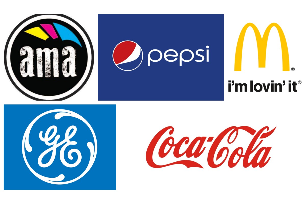
Red is the quintessential “hot” color. While it is commonly tied to fire, violence, blood, or warfare it also ties into positive passions such as love. It tends to be the most aggressive and powerful color and can overwhelm a design if used in combination with other colors. Many iconic brands feature red as their centerpiece color, Coca-Cola likely being the most recognizable. For a beverage company like Coke, evoking the excitement and energy from the color red goes a long way in crafting a memorable image and stimulating appetite.
Yellow
While yellow is also a “hot” color, it is much less aggressive than red. Think about stoplights for example. Where red means stop, yellow means slow down. It is a bright, energizing color that recalls the sun and everything associated with it. It can be a sign of hope, new beginnings, and good cheer. McDonald’s is the big example here, as it traditionally ties itself to happiness in all of its marketing and branding as seen with their Happy Meals.
Blue
Blue is the “cool” primary color, and one of the most diverse in applications. The common phrase “I’m feeling blue,” is used to describe when someone is sad or lonely, but that is not especially useful for branding. The other side of blue is the feelings of calmness and stability that it evokes. Bright blues recall an energizing open sky, while deeper ones like navy evoke water and its essential role in our lives. The logos of many massive companies, such as GE, use blue to give off a sense of stability and power.
So how do you go about combining some of these colors, when they often create entirely opposite responses? Take a look at the Pepsi Globe, which mixes in red, white, and blue. For Americans the association is an obvious and intentional reference to the flag, Pepsi first adopted the color scheme during World War II as a way of showing support for the troops. It evokes passion and patriotism with the bold red, but tempers things with the royal blue and totally neutral white. Altogether, it creates a nostalgic feel that is almost ubiquitous for an American soda drinker. For international consumers, the colors create a sense of classic America, which is fitting for a brand more than 100 years old.
To learn more about how the designers at AMA can help you maximize the value of color to reflect your brand, visit them at printama.com.